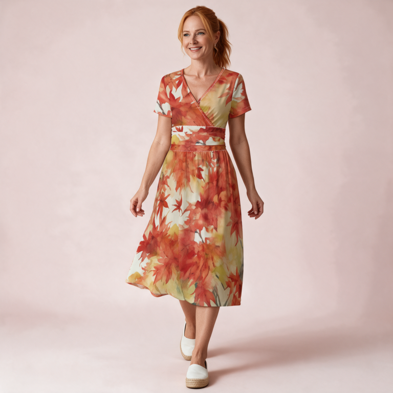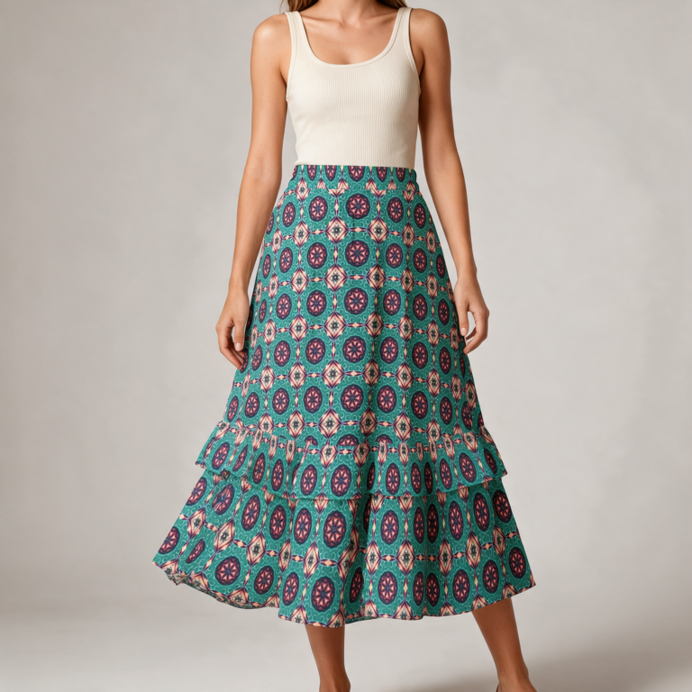
Building Outfits Around a Printed Statement Piece
To style a statement print, give it one job and let everything else stand down. Pull two or three colours that already live inside the print, build the rest of the outfit from those, and keep every other shape simple. A bold print does not need help. It needs room.
The instinct to add more is understandable and almost always wrong. A printed maxi dress is already the interesting thing in the room, and anything competing with it reads as noise rather than confidence.
Read the print before you style it
Two minutes looking properly at the thing will save you three failed attempts in front of the mirror.
Pull the colours out
Lay the piece flat and find the colours actually present, not the one you think of it as. A print you would describe as blue usually contains four or five other things — a warm ochre in the shadows, a near-black in the outlines, a dirty cream in the negative space.
Those secondary colours are your palette. They are the ones that will look considered rather than coincidental, because they are already in conversation with the print. The cream in the background of a dress is a far better match for a jacket than any navy you own.
Note the scale
Large-scale prints with a lot of open ground behave like a solid from across a room and can take a strong shoe or a real coat. Dense small-scale prints read as texture up close and as a single tone at distance, which means they layer more easily but need something with presence nearby or the whole outfit goes flat.
Scale also decides where the eye lands. A print with one dominant motif has a focal point, and you should know where it sits on your body before you add a belt through the middle of it.
Note what it is printed on
The same print behaves like three different prints depending on the cloth underneath it, and this catches people out more than scale does.
On chiffon, a print moves and breaks up. The pattern is never fully legible because the fabric is always in motion and semi-transparent, which softens even a very loud design. A chiffon print is a quieter garment than its swatch suggests.
On satin, the opposite. The surface reflects, so the print is interrupted by highlights and shadow as the fabric folds, and colours read more saturated than they do flat. A satin print is louder than its swatch, and it gains a second pattern — the light itself — that you cannot control.
On jersey and anything with stretch, the print distorts over the body. A regular geometric can curve, and a motif can sit larger across the fuller parts of you than it does on the hanger. Usually fine. Occasionally the reason a piece looks wrong without anyone being able to say why.
None of this is a problem to solve, only a thing to know before you assume a print will look the way it did on screen.
Image to add — 4:5 portrait (1200 × 1500)
The same or similar print shown on three fabrics side by side, hung so each falls naturally: chiffon catching light and showing translucency, satin with visible highlights in the folds, matte jersey. Warm neutral wall.
Alt text: The same print shown on chiffon, satin and jersey to compare how each fabric changes it
Image to add — 4:5 portrait (1200 × 1500)
A printed garment laid flat on a sand-coloured surface with four small paint chips or fabric swatches placed along its edge, each matching a colour pulled from the print. Overhead, natural light.
Alt text: A printed dress laid flat with four colour swatches matched to tones within the print
The supporting cast should be quiet
Everything else in the outfit has one instruction: do not raise your voice.
That does not mean beige. Quiet means unpatterned and drawn from the print’s own palette, and it can be a deep wine or a strong ochre as easily as a neutral. What it cannot be is a second thing asking for attention.
The reliable structure is one loud piece, one mid-weight piece that picks up a colour from it, and one anchor at the bottom in the print’s darkest tone. Shoes in the darkest colour of the print will tie an outfit together more effectively than almost any other single decision, and nobody will be able to tell you why it works.
Solid knitwear, solid outerwear, solid legwear. A plain high-waist legging under a printed tunic or short dress does exactly this job — it holds the bottom of the outfit still so the print can move.
Shape is doing more work than you think
Two loose things stacked on top of each other is the most common way a statement piece goes wrong, and it has nothing to do with the print.
If the printed piece is voluminous, the thing next to it should be close to the body. If the printed piece is narrow, you have licence to go generous elsewhere. One volume per outfit. This is the rule that rescues most failed attempts, and it is almost always the one being broken.
The corollary: a printed maxi is already a lot of fabric and a lot of surface. Layer it with a fitted knit, a slim jacket, a short structured coat. Save the enormous cardigan for a day the print is staying in the wardrobe. Layering a maxi dress through fall goes into this properly, because the volume problem gets harder once the weather forces a coat into the equation.
Mixing a print with another print
It can be done. It is not the beginner move it is sometimes presented as, and it fails in predictable ways.
Two prints work together when they differ clearly in scale and share a colour. A large open floral with a fine stripe, both containing the same ochre, will look deliberate. Two medium-scale prints in unrelated palettes will look like you got dressed in the dark, regardless of how good each one is alone.
- Different scale, shared colour — works, almost always.
- Same scale, shared colour — risky. The eye cannot decide where to settle.
- Different scale, unrelated colours — rarely works, and only when one print is very quiet.
- Same scale, unrelated colours — no.
The safest version of print-mixing is to let one of the two be something small: a scarf, a bag, a bandana. You get the effect at a fraction of the risk, and you can remove it at the door if you change your mind.
Image to add — 3:2 landscape (1800 × 1200)
Two printed fabrics overlapping on a neutral ground: one large-scale open pattern, one fine dense pattern, sharing a single warm colour. Flat, overhead, soft shadow.
Alt text: Two printed fabrics of different scale overlapping and sharing one warm colour
Where accessories help and where they interfere
A statement print leaves less room for jewellery than a plain dress does, which is the opposite of what most people assume.
Fine, quiet pieces work. One substantial piece works, if it sits somewhere the print is not busy. What does not work is a handful of medium-sized things distributed across a patterned surface, because they disappear into it and you have simply lost them.
Bags and shoes are where to put weight. Both sit away from the print, both read as solid blocks of colour, and both are the easiest way to pick up a secondary tone without anything having to match exactly. Matching exactly is not the goal and never looked as good as people hoped.
Belts are the one to think about twice. A belt cuts the print in half and relocates the focal point to your waist. Sometimes that is exactly right. It is worth deciding rather than defaulting.
Four outfits, built the same way
The method, applied. Each is one loud piece, one supporting colour pulled from it, one anchor.
- Daytime, warm. Printed maxi dress, flat sandal in the print’s darkest tone, fine gold chain, nothing else. The dress is the outfit.
- Daytime, cool. Printed maxi, fitted ribbed knit in a colour pulled from the background, ankle boot in the darkest tone, structured bag.
- Evening. Printed skirt, plain silk-feel tank in the print’s secondary colour tucked in, heeled mule, one substantial earring.
- Travelling. Printed top, plain high-waist legging in the darkest tone, long plain cardigan, trainers. Comfortable without reading as sportswear.
The one that photographs best is usually the second. Taking a satin set out of the house runs on the same logic if you want to see the method applied to something people assume cannot leave the bedroom.
One test before you leave
Stand back far enough that you cannot read the detail of the print. Six feet, or squint.
At that distance, an outfit should resolve into two or three blocks of colour with a clear hierarchy. If it resolves into a jumble with no obvious main event, something is competing that should not be, and it is almost never the printed piece that needs to go.
If it resolves into one flat undifferentiated mass, you have gone too quiet and need one more note of colour — usually at the feet.
It is also worth knowing what you are looking at. An all-over print that runs unbroken across the seams sits differently on the body than a panel printed onto the front of a garment, and it drapes differently too, which affects every decision above. Why all-over print garments feel different covers that, and the broader question of dressing without the rules covers the part where you decide none of this applies to you today. The After-Hours Maxi is the piece most of the above was written against.