Choosing a Print That Works With Your Shape
Most advice about prints and body shape is nonsense dressed up as rules — vertical stripes slim you, large prints overwhelm petite frames, and so on. Some of it has a grain of truth. Most of it is a way of telling women to take up less room.
Here is the useful version: prints do not flatter or unflatter a shape. They direct attention. Once you know where a print sends the eye, you can decide where you want it to go.
The only three variables that matter
Scale
How big the repeat is relative to your frame. A large repeat on a small frame reads as bold — which may be exactly what you want. It only reads as “wearing the print” if the garment is also oversized.
Density
How much ground colour shows between motifs. Dense prints behave like textured solids. Sparse prints create focal points wherever a motif lands.
Contrast
The difference between the lightest and darkest parts. High contrast draws the eye hard. Low contrast, tonal prints are the quietest way to wear pattern at all.
Placement is the real lever
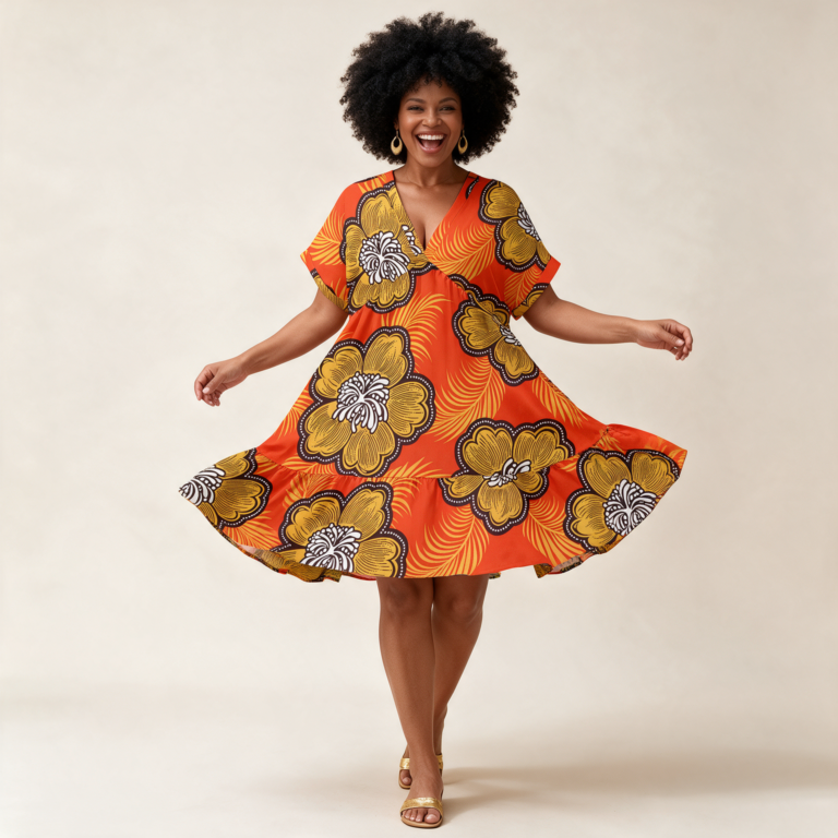
Where a motif falls on a garment matters more than how big it is. A large bloom centred on the bust is a decision. The same bloom at the hip is a different decision. Neither is wrong, but both are choices, and on an all-over print the placement shifts with the cut.
Practically: look at the product photo and notice where the busiest, highest-contrast part of the print sits. That is where people will look.
If you want the eye somewhere specific
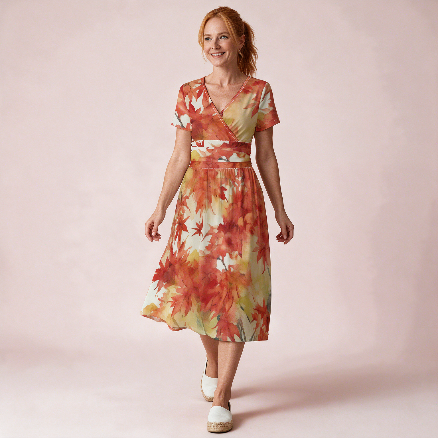
- Upward, to the face. Print concentrated above the waist, a plain or tonal lower half, a v-neckline. A v-neck midi does this naturally.
- To the waist. A print that changes at the waist, or a belt in a colour pulled from the print.
- Downward, to the hem. Tiered skirts with print variation, or a border print. Our tiered maxi skirts sit here.
- Nowhere in particular. A dense, low-contrast, small-repeat print all over. This is the closest print gets to a neutral.
The rules worth ignoring
- “Large prints overwhelm small frames.” They do not. They read as confident. Fit matters far more than scale.
- “Dark colours are more slimming.” Contrast and cut do this work, not colour.
- “No horizontal lines.” Placement and frequency decide the effect, not direction.
- “Prints are for the young.” Prints reward taste, and taste takes time.
Start from the cut, not the pattern
Find the silhouettes that already work on you — the necklines you reach for, the hem lengths you feel good in — and then choose prints within those. A print cannot rescue a cut that does not suit you, and it cannot ruin one that does.
Once you have that, the dresses and tops become much easier to shop, because you are filtering on shape first and pattern second.
Questions we get
I have never worn print. Where do I start?
One piece, small dense repeat, in a colour family you already own — then wear it three times with things in your wardrobe before buying another.
Can I wear two prints at once?
Yes, if they share a colour family and differ clearly in scale. Same scale, different colours is the combination that fights.
What about print at the bust if I am fuller-chested?
Only relevant if you want less attention there. If you do, choose prints that quieten above the waist and get busier below. If you do not, ignore the question entirely.